
Creating a brand ready to scale
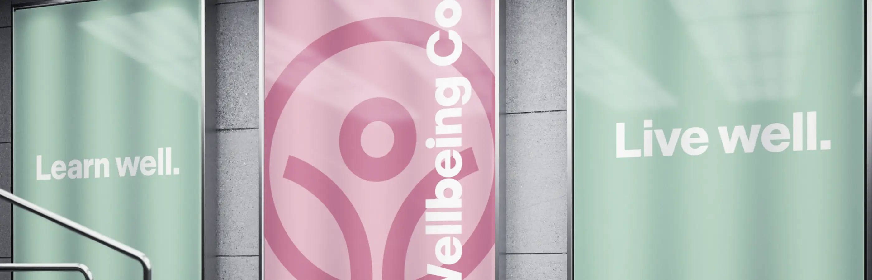
Previously trading as Your Well-being Company, we recommended simplifying the name to Wellbeing Co.
The new name gave the business a much stronger foundation. It was shorter, more memorable and more confident, while giving the brand room to grow into new services, products and areas of the business over time.
From there, we developed a complete visual identity designed around what Wellbeing Co. wanted to become, not simply what it had been before.
The previous brand no longer reflected the organisation's calibre or the businesses it was already supporting. Our aim was to create something approachable and human while giving corporate decision-makers confidence that they were dealing with an established, professional wellbeing partner.
Giving the identity meaning
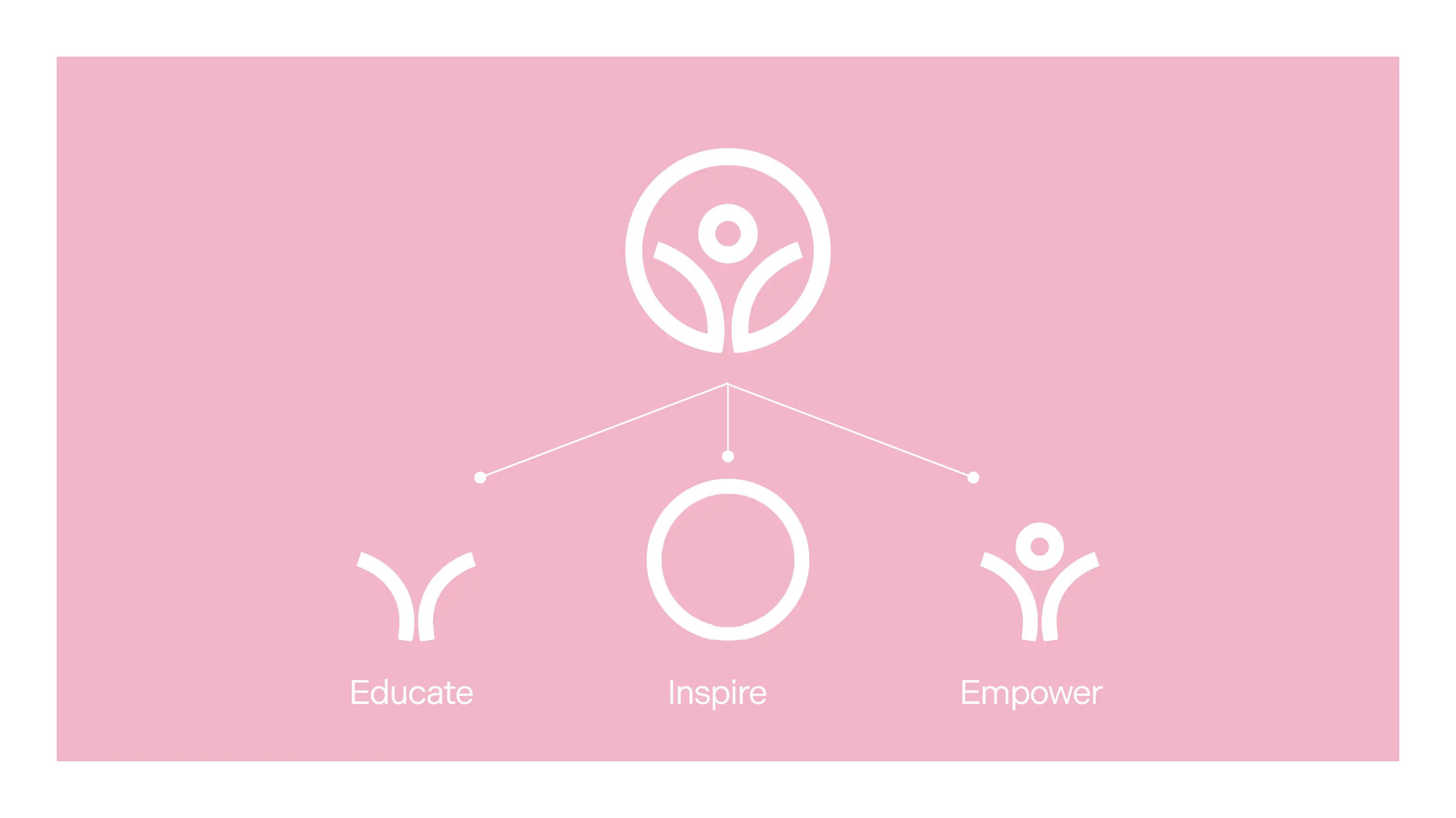
A key part of the Wellbeing Co. approach is built around three principles:
Educate. Inspire. Empower.
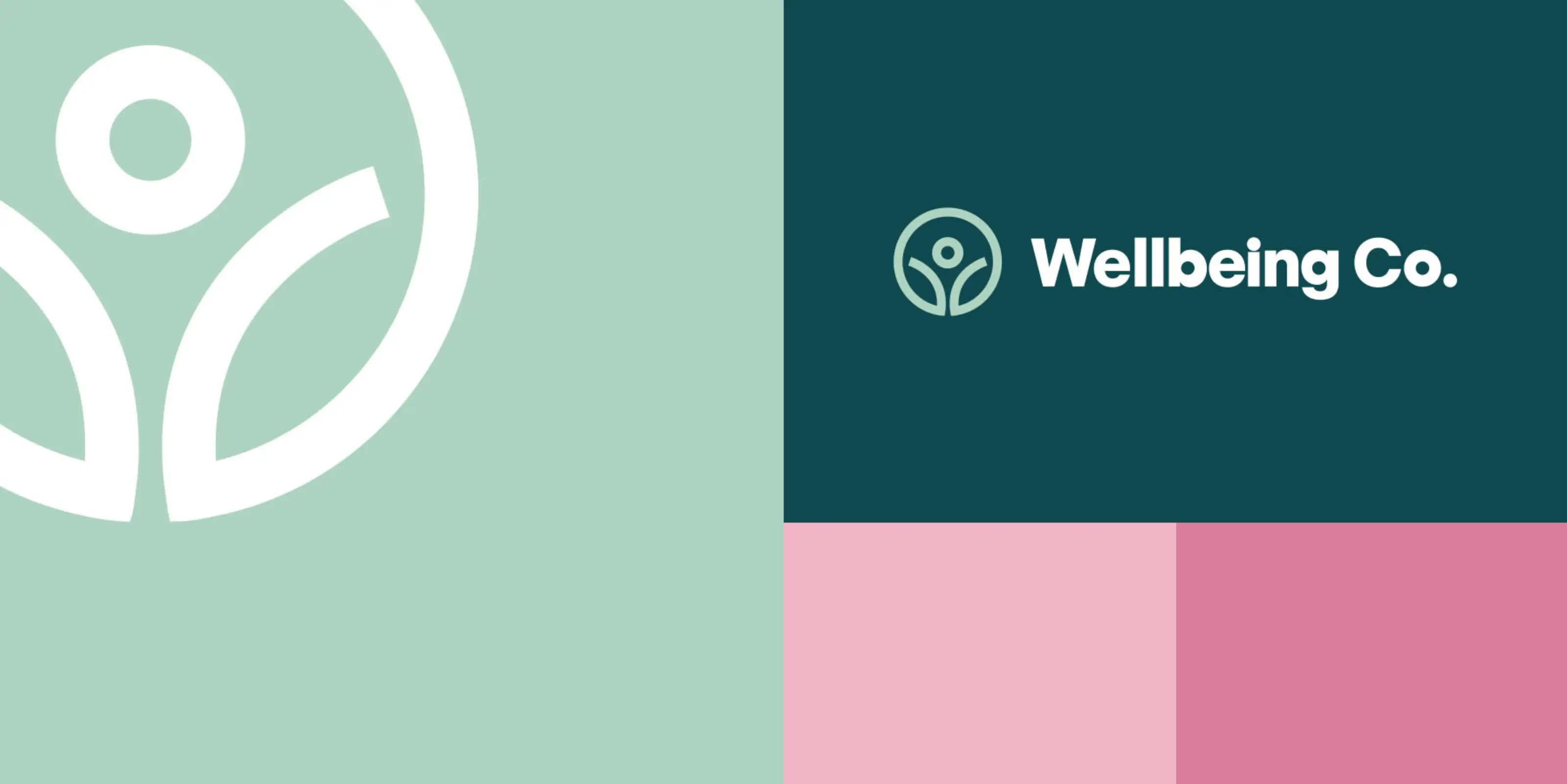
We created an individual icon for each principle, then brought all three together to form the central Wellbeing Co. brand mark.
This gave the identity meaning beyond simply looking good. The brand system was rooted in how Wellbeing Co. works with its clients and the outcomes it aims to create.
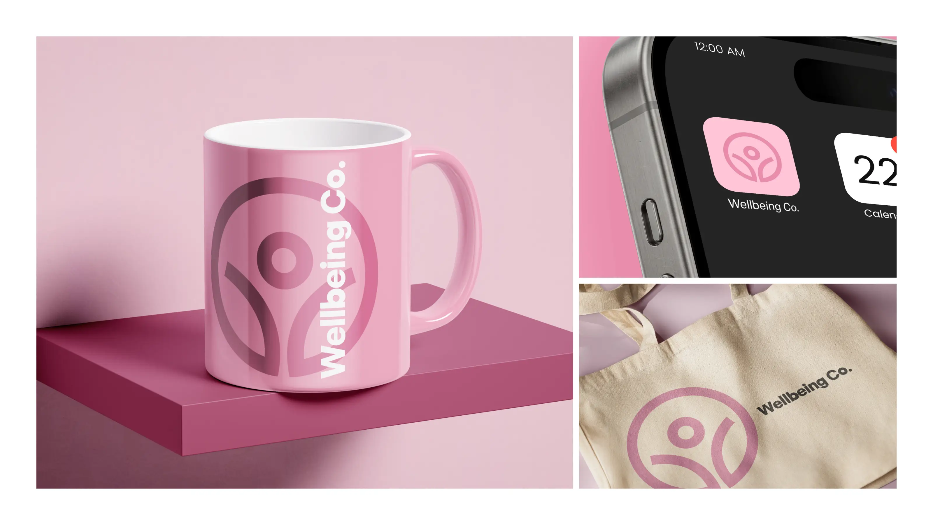
The colour palette was designed to strike the right balance between softness and strength, reflecting the wellbeing sector without feeling overly clinical or corporate.
We also designed the system to grow with the business. Different colour combinations can be applied across services, campaigns and future digital products while maintaining a consistent and recognisable identity.
"I am SO SO happy with how it’s turned out 👏🏻👏🏻 thank you guys!"
Translating the brand into a digital experience
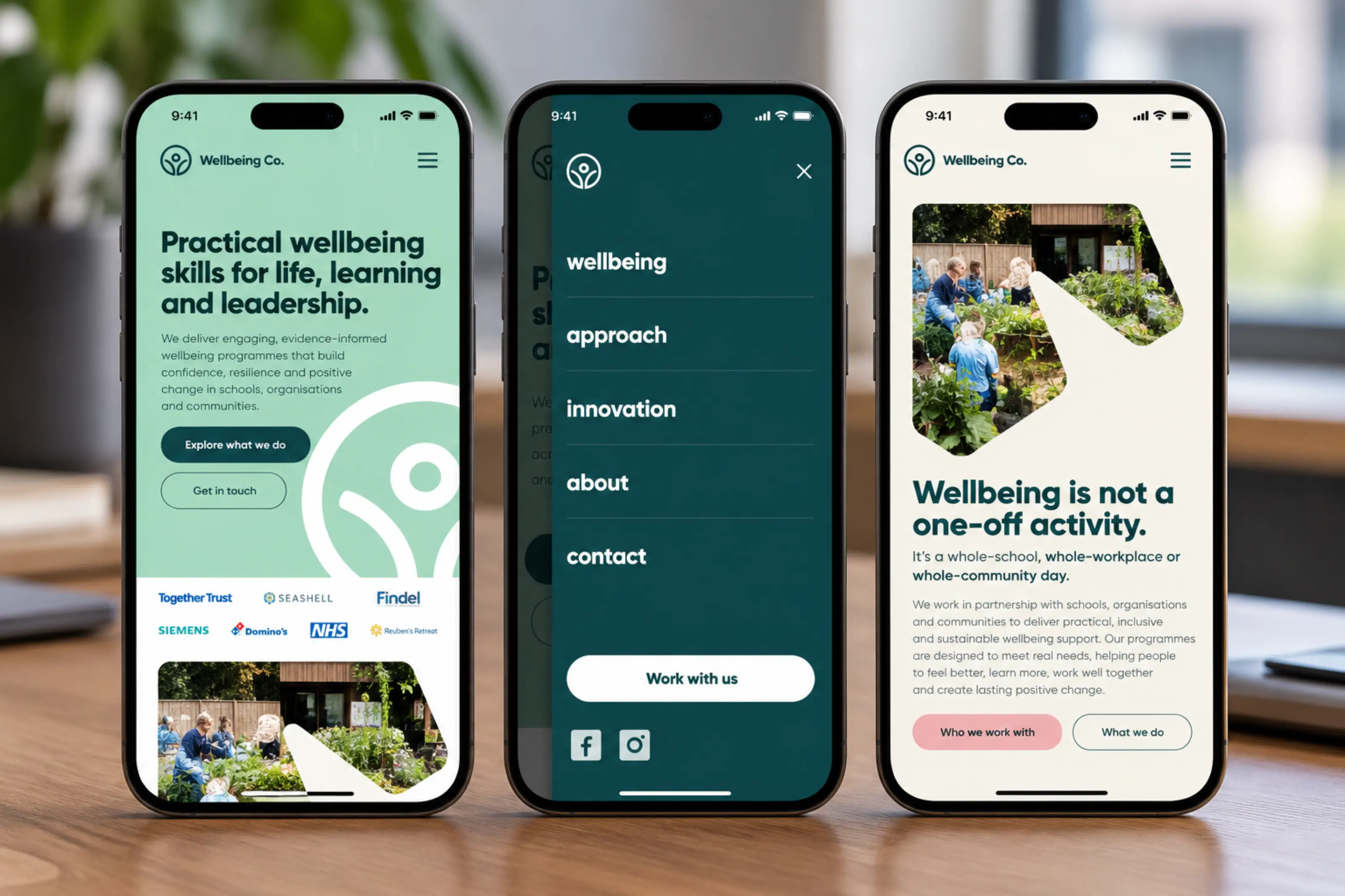
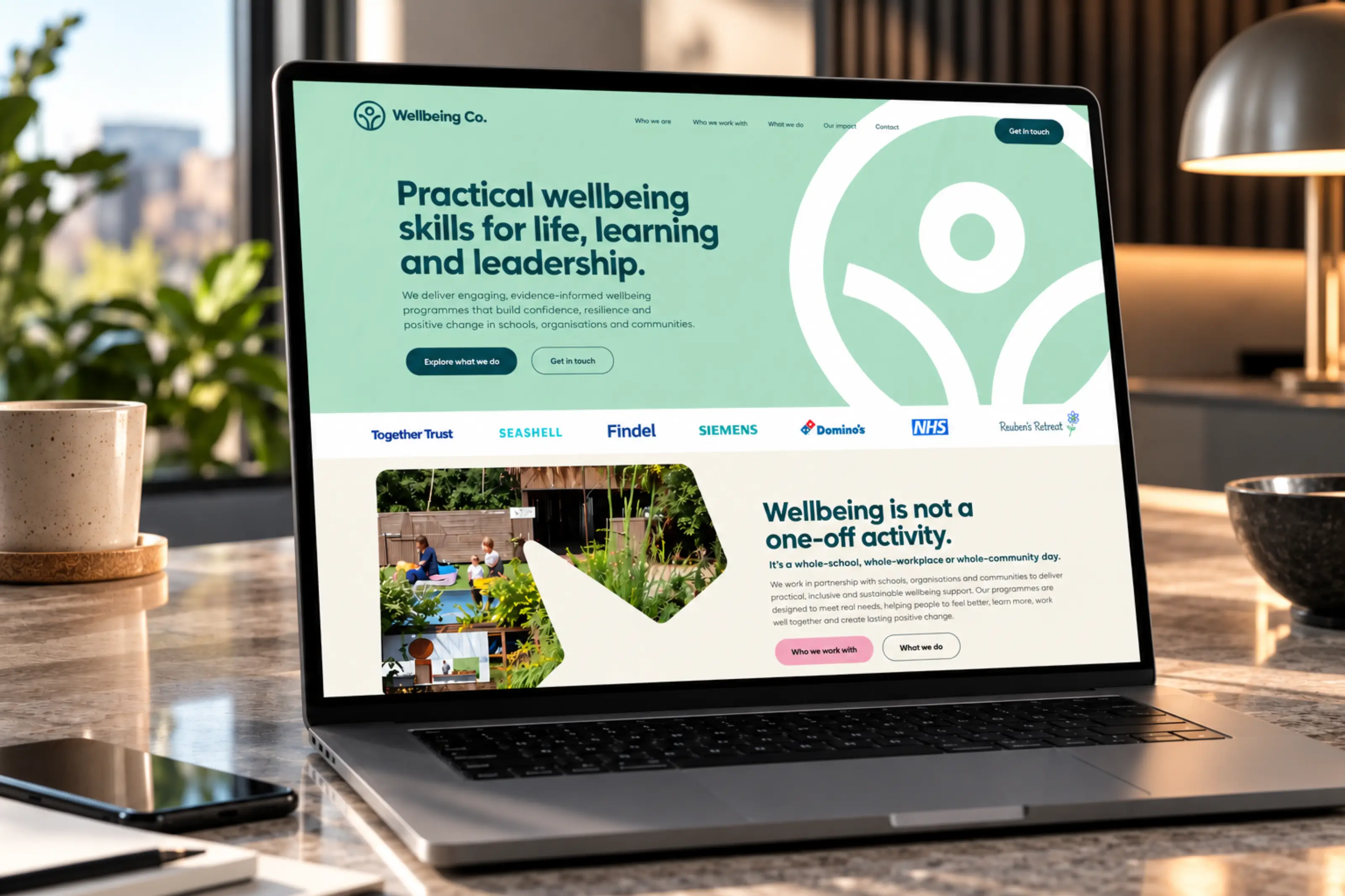
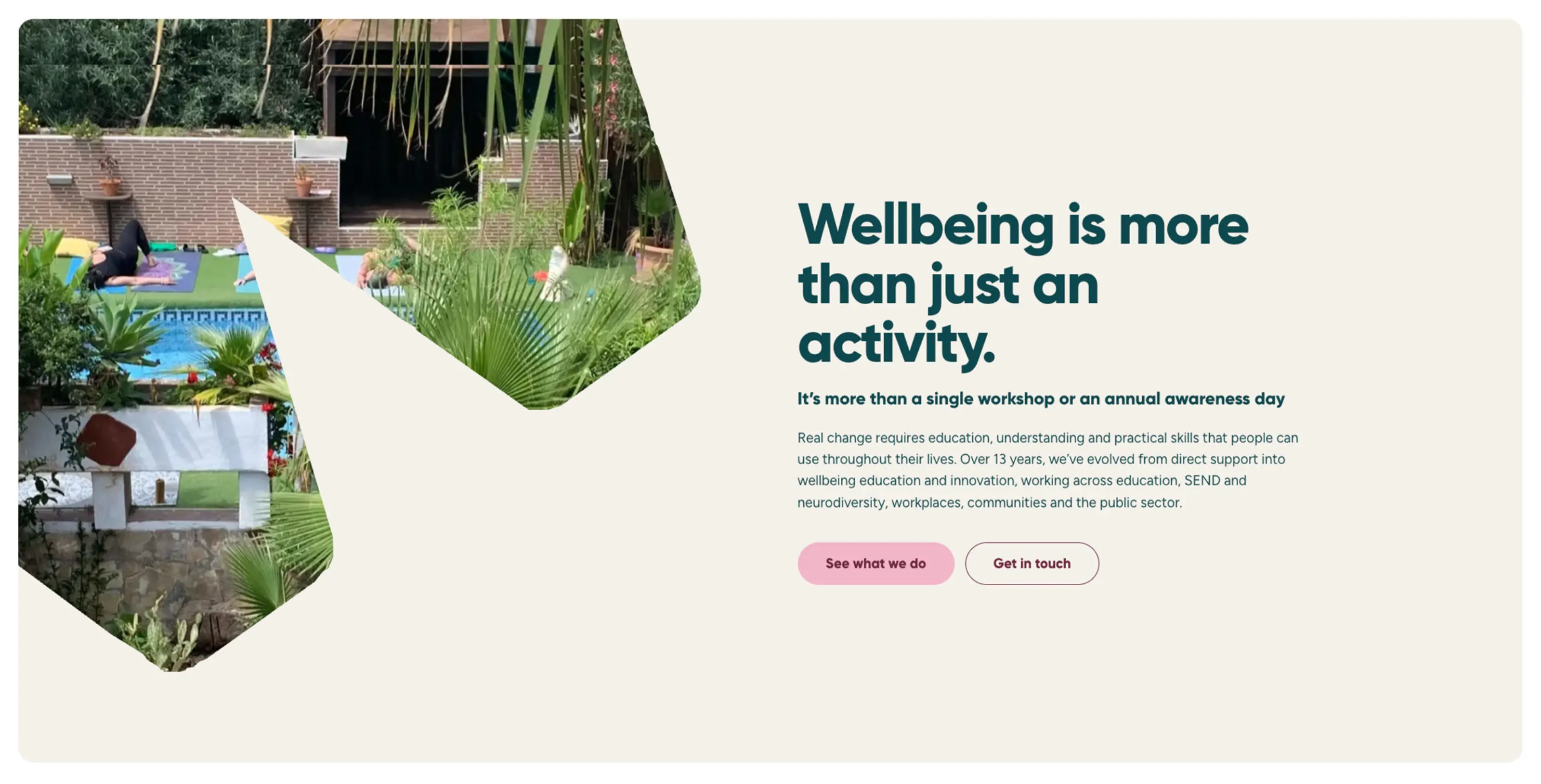
Once the identity was in place, we helped Wellbeing Co. transition the business digitally with a completely new single-page website.
The website needed to establish trust quickly, clearly communicate the range of services available, demonstrate the breadth of Wellbeing Co.'s activity and generate new enquiries.
We developed the structure, messaging and user journey around those objectives, making it easy for prospective clients to understand the business without having to navigate through unnecessary pages.
Recognisable client relationships, clear service information and strong calls to action help reinforce credibility throughout the experience, while the overall design gives Wellbeing Co. a much stronger platform for future marketing activity.
Designed around growth
This was never simply a branding exercise.
The wider objective was to help Wellbeing Co. become better prepared for scale.
Every decision, from the naming and identity through to the website structure and digital foundations, was considered around where the business wanted to go next.
By simplifying the brand, strengthening the proposition and creating a more professional online presence, Wellbeing Co. now has a platform that better reflects the organisation behind it and supports its ambition to attract larger corporate opportunities.
A relationship that continues beyond launch
One of the best parts of this project has been working with Sarah.
Her enthusiasm for Wellbeing Co., the people they support and the direction she wants to take the business is infectious. That energy made the whole process incredibly collaborative and gave us the freedom to really push the brand forward.
The response to the new identity and website has been incredibly positive and our relationship with Wellbeing Co. continues beyond launch.
We’re now supporting Sarah and the team with ongoing digital guidance, training and strategic support, helping them continue to develop the brand and prepare the business for its next stage of growth.
What we delivered
- Brand strategy and positioning
- Naming consultancy
- Brand identity
- Bespoke icon system
- Colour palette and visual system
- Brand guidelines
- Messaging and copywriting
- Website strategy
- UX and information architecture
- Bespoke web design
- Web development
- Responsive design
- Enquiry functionality
- SEO foundations
- Analytics and tracking